
Colour plays a big part in the human mind. It is awesome to think that mere shades and tones can influence the way that we make decisions and marketers have realised this. Logos and colour schemes of famous brands are all evidence of how the right colour can make an impact in the market and in a company’s success.
And it’s not just for advertisements and logos either, the colour schemes of websites might also affect how often visitors will interact as well. We can look at when HubSpot did an experiment where they found that the red call-to-action (CTA) button got more clicks than the green CTA button as an example of how colour can affect people.
In this article we will go over what is colour psychology and how it can be potentially be implemented into your marketing plan. We will look at different examples of colour and what they can perceive and mean for people who view them and we will also take into account real-life examples to further explain the correlation of colour psychology and marketing.
What is Colour Psychology?
In short, colour psychology is the study of different hues of colour as an influence of human behavior.
Affect on Food and Products
Color can have and effect perceptions that are not obvious, such as our taste of food. It can affect how people can make out a certain food or drinks edibility and flavour.
And it does not have to be the colour of the food itself, sometimes the packaging of the food or any other factors in a person’s field of vision when looking at a food can affect how a person can perceive it.
We can take an excerpt of Steven Bleicher’s book, “Contemporary Color: Theory and Use”, for an example. Bleicher mentions how in food stores, bread is normally sold in golden or brown toned and decorated packaging to promote the idea of bread that is home baked and oven fresh.
Maya U. Shankar, in her article, “The Influence of Color and Label Information on Flavor Perception” gives another case. She mentions how individuals can think a cherry flavored drink would be lime or lemon flavored if that drink had green colouring. Or how people can think colour can intensify flavour as some can perceive a brown M&M as being more chocolatey than a green M&M.
The placebo effect of items, especially pills, are enhanced with the use of colours as well. For example, red colours are used for pills which are used as stimulants, while blue pills are depressants. This has been believed to be the result of the expectations the the patient taking these pills, as stated by AJ de Craen in the article, “Effect of colour of drugs: systematic review of perceived effect of drugs and of their effectiveness.”
Preferences of Different People
In the field of colour psychology, it looks at colour preferences, which is basically looking at an individual or a groups favourite or preferred colour based on their different factors such as age, gender, nationality and cultural background.
Looking at the colour preferences is very important in the field of marketing, especially if a company were to market to a specific group of people.
National & Cultural
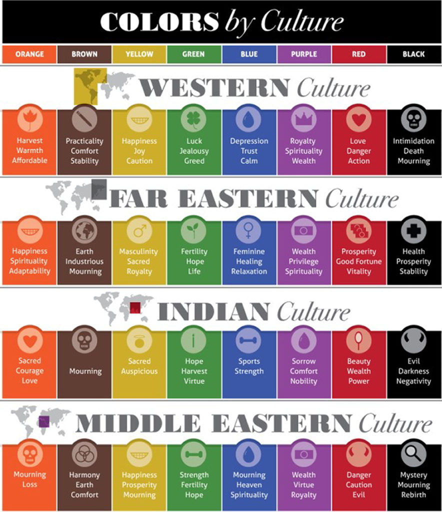
In a survey done by YouGov.com, the results showed that the colour blue was a preferred colour of the people in 10 countries including Malaysia. It showed that 25% of Malaysians preferred the colour blue. The second most popular colour however varies from country to country. Green comes in second for people in the United States, Thailand and China, while Indonesia, Singapore, Germany and Britain, the second most prefered colour is red. In Australia and Malaysia, the colours red and purple both take second place in that same survey.
According to Dennis Dutton, an American philosopher of art, the preference for blue and green may be due to a preference for certain habitats that were beneficial in the ancestral environment. The least favourite colours among people seems to be yellow, brown and orange.
A color preference may also differ based on where a person is situated in the world, more specifically, the temperature and climate of their current location. People in colder climates may prefer warm colours like red or yellow, whereas people in warmer and hotter climates prefer cooler colours like blue or green, as stated by TW Whitefield in “Color Psychology: A Critical Review.”
Social Aspects
According to a research done on “The effect of an advertisement’s colour on emotions evoked by an ad and attitude towards the ad,” by Marie-Christine Lichtlé, introverts also prefer cooler colours, whereas extroverts prefer warmer colours.
Gender
In a 2003 study by Joe Hollock, 232 people, from 22 countries and from various demographics, were asked what their favourite colour was. For both male and female, blue was the most popular with 57% of males and 35% of females preferring blue. Green comes in second for both groups.
But out of all the males in the group, none said that purple was their preferred colour, while 23% of women favoured that hue. So far, this statistic highlights the notable differences in both genders from the sample group.
However, males and females seem to share the same distastes in certain colours as well. Hollock’s experiment showed that yellow, brown and orange are the colours that are least favored by both male and female, with brown being less favoured for men and orange being less favoured for women; 27% of the men in the sample group did not favour brown, while 33% of women did not favour orange.
In 2007, a University of Newcastle team, led by Professor Anya and Professor Yahzu Ling explored this even further. They wanted to see how both groups, male and female, perceive colour. To do this, they divided the colour spectrum into two groups, the first group of colours were red-green colours while the second was yellow-blue colours. The colours were then taken out of both the groups and shown to participants in the form of two coloured rectangles on a screen. The participants would then choose their preferred colour before moving to the next pair. This experiment showed similar results to Hollock’s experiment, where both male and female participants favoured blue.
But when asked which mix of colours people of both groups favoured, the results showed that females preferred mixes with red in them where shades of pink were found. When it came to bright and soft colours, males preferred bright, while females preferred soft colours.
Males were also more accepting of achromatic colours than females. Achromatic colours are colours which have no hue, like black and grey.
Attraction
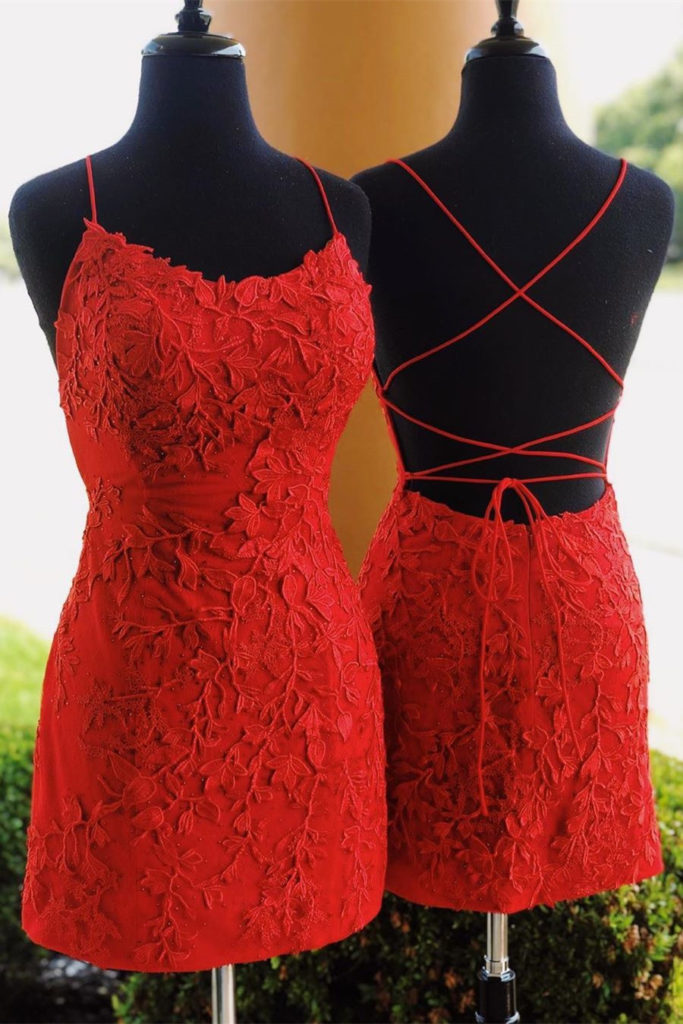
In 2008, psychology professor at the University of Rochester , Andrew J. Elliot, did a test to see whether the color of a person’s clothing would make them appear more sexually appealing. He found that heterosexual men, were more attracted to women dressed in the color red and that women dressed in red to them were more likely to attract romantic attention than women dressed in any other color. Heterosexual women were also shown to have a more romantic attraction to males dressed in red too.
Age
In his book, Color Psychology and Color Therapy, Faber Birren states that as people become mature, they start to develop a liking to hues with longer wavelengths, so colours like blue, green and purple. But as children, they prefer hues of shorter wavelengths, like red, orange and yellow.
Joe Hollock’s experiment however, showed that the colour blue was still a popular hue in the age groups from 1 to 70. So there is no sure way to fully compare results at the moment, and the fact that Joe Hollock conducted this research in 2003, might mean that preferences could’ve changed.
TW Whitefield states that children’s colour preferences are more likely to change and can vary from child to child in that particular age group. Adults on the other hand, have preferences which are not as flexible.
But so far, it is safe to say the blue has remained the most favoured hue of all.
Culture
Studies have shown that regardless of race or ethnicity, a person’s preference in colour may also be affected by the location and surrounding they are in, and they may share that favoured colour with other people in the same region, no matter what their ethnic differences are.
In Germany, Mexico, Poland, Russia, and the United States, an experiment was done to examine color associations with the emotion of participants in those countries. The results showed that the color red was associated with anger and was perceived as strong and active in all the nations, but in Poland, the colour purple was associated with both anger and jealousy. In Germany, the colour yellow was associated with jealousy. These small differences could indicate how culture can have an impact on colour preference.
6 Principles
TW Whitefield states that the model of colour psychology is dependant on 6 principles, they say that:
- Colour can carry a specific meaning.
- The meaning of a colour is either learned or biologically implanted in our minds.
- The perception of a colour causes a person to automatically evaluate it.
- The process of evaluation causes behavior that is colour-motivated.
- A colour’s influence is exerted immediately.
- The effect and meaning of a colour can be altered by the context put on it.
Colour in Marketing
Colour psychology plays a big part in most companies marketing plan, especially in branding since branding is all about visuals and how a company presents it’s ‘face’ to the consumer.
Marketers must tread carefully when it comes to the use of color in different media platforms. They must understand and figure out as the meanings and emotions that a particular audience can assign to colour.
Although there have been several attempts to classify consumer response to different colors, in the end, everyone perceives color differently. The physiological and emotional effect that colour can have in each person could be influenced by an array of factors such as past personal experiences, their culture, their religion, the natural environment they are in, their gender, race, and nationality, etc.
Before any decision is made for a colour or colour scheme, you will need to properly determine the target audience as this step is very important if you intend to convey the right message to them.
The decision you make for a colour to be used in marketing could have an influence on both direct messages and secondary brand values and attributes in any communication.
With that in mind, colour should be carefully selected to align with key messages and emotions being put through in your marketing campaigns.
Colours and What they Could mean
Below, we list some colours and their meaning and perception in the marketing world.
Red
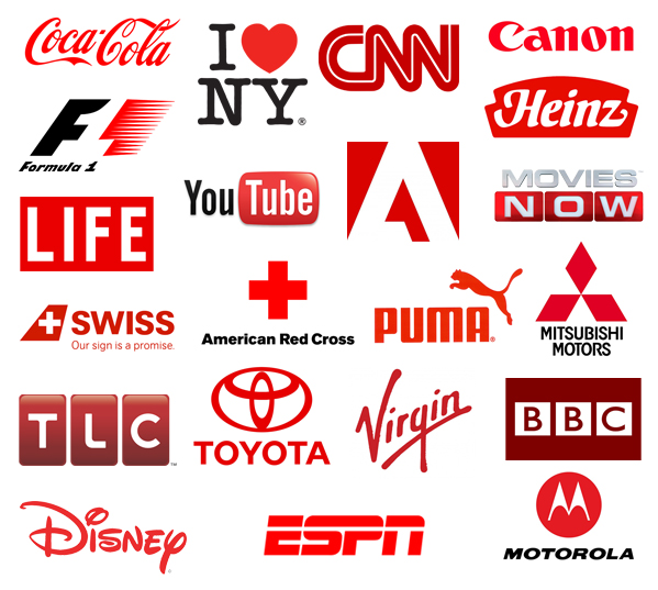
This colour can help create a sense of urgency, perfect for stores having clearance sales (you might have noticed this in shopping malls.
It also encourages appetite, which is why you see it used by most fast–food chains. The sight of red could assist in stimulating the body, raising the blood pressure and heart rate. It is often associated with likes of movement, excitement, and passion.
But the use of this colour should be taken with caution as red could also mean anger, danger, pain or could be like a warning. It could all depend on how you layout a piece with it’s own context.
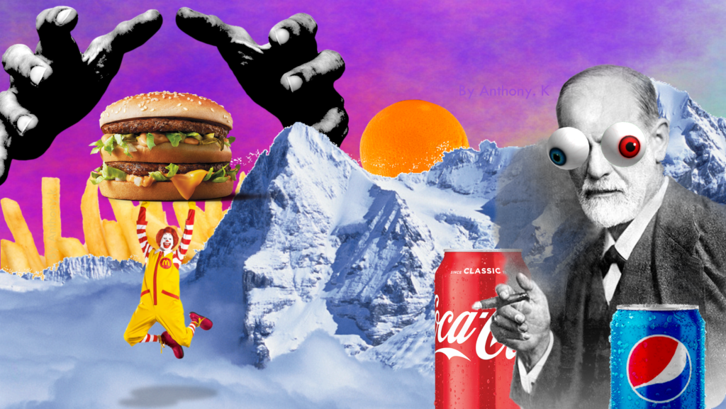
Some famous brands which use the colour red could include Coca-Cola, Virgin, H&M or McDonald’s and KFC.
Blue
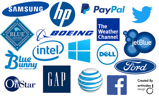
Blue, being the most favoured colour throughout,could be associated with peace, water, tranquility, and reliability. The colour can have a very calming effect on the mind as it could provide a sense of security and stimulate productivity. This colour is often used by more conservative brands looking to promote more trust in their products. It could signal loyalty and dependability.
You will not find a lot of food brands using the colour blue alot, this is because blue is not often associated with food, so perhaps it may suppress one’s appetite.
Well known companies which use blue predominantly could include Nivea, Visa, PayPal, Allianz, Ford and Facebook.
Notice how some of the companies listed above are involved in finance and insurance.
The colour however, could also give out a message of coldness, a lack of emotion or unfriendliness. And again, it is a rather unappetizing colour.
Green
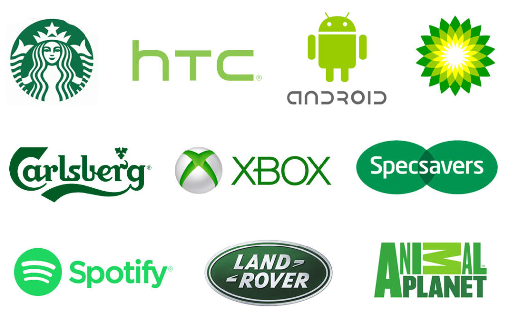
This colour would often be associated with health, hope, growth, and nature. It could be used in stores to relax customers and could also be used for promoting environmental issues. Green can help stimulate the feeling of harmony in your brain.
Plants, trees and grass are green, so the colour could be associated with life. Some organic brands may use this colour for this reason.
The colour could also mean having a touch with nature as well. Some famous brands that use green include Animal Planet, Woolworths, LandRover, Starbucks and Android.
Green could also signify stagnation, boredom, envy or blandness.
Orange
This colour could help induce a feeling of warmth, as it could be associated with the sun or fire. It is a fun colour and would usually not be used in conservative corporate brands. In some countries, the colour orange could be associated with the autumn season.
Famous brands that use orange could include Harley Davidson, Amazon, Nickelodeon or Mozilla Firefox.
Orange could also bring about the feeling of immaturity, ignorance or frustration.
Yellow
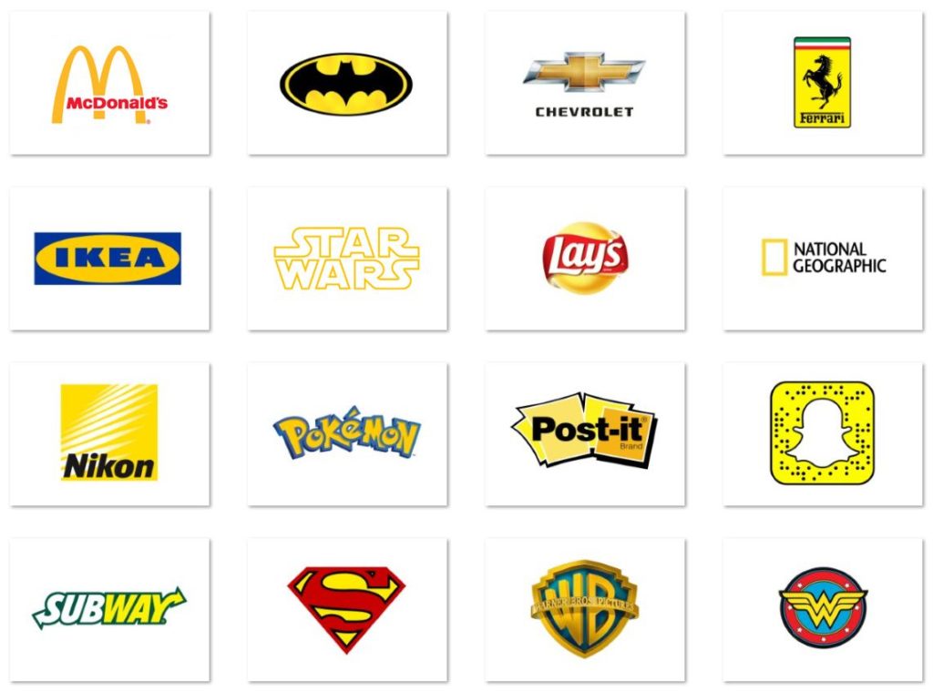
This is another optimistic and fun colour which could often be associated with the sun and warmth. It could present youthfulness and creativity.
Famous brands that include yellow in their marketing include Ferrari, Lamborghini, McDonald’s golden arches, Ikea or CAT.
Yellow might be a bit too bright at times and may just be an eyesore when not placed properly. It could also give a sense of caution and fear as well.
Black

This achromatic colour can represent authority, power, luxury, and strength. It is often used as a symbol or indicator of intelligence. High-end brands are known to use this simple minimalistic shade to promote themselves.
Brands like Hugo Boss, Nespresso or Jack Daniels use the colour black a lot in their marketing.
However, black would be best avoided for health based brands, as the colour could symbolize death in some cultures. Black might also give the impression of coldness or evil.
White
Concepts of purity, cleanliness and safety can be associated with the colour white. The absence of a hue could indicate neutrality. A white space could help expand creativity as it is similar to that of a blank canvas, waiting to be decorated.
White also gives a more modern feel, but when brands dedicate to using white as their main tone, they will need to show some restraint when it comes to design, although white may look like a blank canvas it can also have a limit on what we can do aesthetically.
When done properly white can give the feel of sleekness, modernity and minimalism. But when not done properly, it could give the impression of laziness or emptiness.
Famous brands which use white could include Apple, Tesla or Zara.
Applying Colour Psychology in your Marketing Plan
To reduce the eyestrain and assist your readers when they see your ad or marketing piece, use contrasts. Contrasting can help bring focus to a part you want readers to focus on. This can be done using complimentary colours, these are colours which are on the opposite sides of the colour spectrum wheel. By using these colours, you can create an easy-to-read area.. In its simplest steps, just ensure that you use bright colours for the background and darker colours for the items or texts.
Examples of Colour Psychology in Brands
Apple
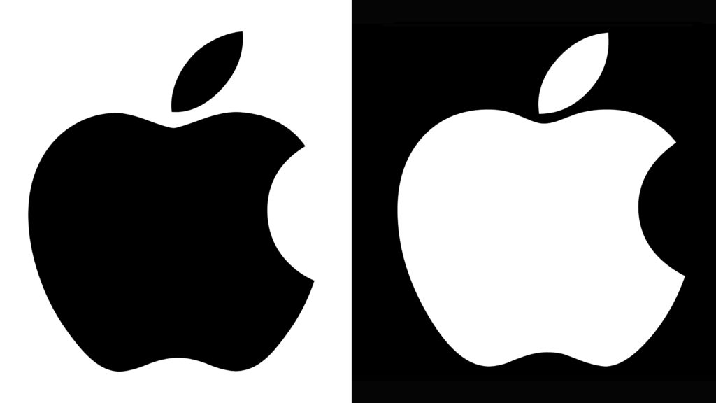
For 20 years, Apple had their famous rainbow coloured apple as their logo to reflect their multi colored iMacs which they sold at the time. This style was not often seen in the computing industry at the time.
Eventually, Apple began to shift their ways and thus, shift their brand personality. Now the Apple logo could either be seen in monochromatic white or black. This was so that Apple could emphasize their products’ simplicity, as this is what their new focus was on. This re-branding of their colour in their marketing plan began to give a sense of being reborn, wiping a slate clean, it represents purity for their products. All pure except for their prices…
McDonald’s

We see this large fast-food chain employ the use of red and yellow for their marketing and their logo. As stated above, we know that red can help stimulate an appetite. The use of yellow in their golden arches could signify excitement, and promote the cheerfulness of their brand. This can be appealing to children as they nag their parents about wanting to go to McDonald’s everytime they see the golden arches on a road trip.
Starbucks
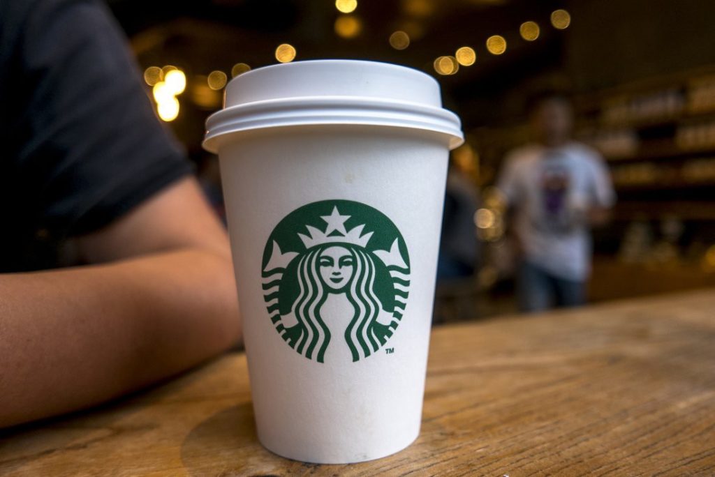
The use of green for this mega coffee chain could help give a sense of relaxation, thus inviting customers to come in for a nice cup of coffee. Their colour scheme along with the use of a mermaid could help signify the brand being in touch with nature.
Conclusion
Hopefully this article has given you some insight in colour theory and how you could potentially use it in your branding. Perhaps you may have learned a thing or two and the next time you go out and about, you can see why a company uses a certain colour.
The human mind is truly captivating, sometimes we may experience something without fully knowing it, and this is how marketers have tapped in to colour theory.
In the end, marketing is not just about using language that sells or having pretty images, marketing, in a way, is the study of how the human mind reacts to certain elements. Thorough study on the behaviors of people can help a great deal for a brand.
So if you are planning to re-brand or start a new one from scratch, do remember that!
If you are looking for an online agency to assist in your marketing needs, with colour psychology in mind, Sterrific offers excellent branding and marketing packages which can help your brand grow. So be sure to drop us an email or a call here – and we’ll be in touch!